Looking at distributions#
One essential element of a reanalysis is that we have gridded data. This means that we have data for each grid cell at every point in time. This is a very different situation than observational time series, which consist of a single time series from a single point that may not be complete in time.
import xarray as xr
import matplotlib.pyplot as plt
import numpy as np
We start by defining the location of the DANRA dataset and then load it with xarray.
xarray works especially well with the zarr format, enabling lazy loading.
This means you can analyze massive datasets interactively without loading everything into memory at once, making your workflow both efficient and scalable.
ds_danra_sl = xr.open_zarr(
    "s3://dmi-danra-05/single_levels.zarr",
    consolidated=True,
    storage_options={
        "anon": True,
    },
)

ds_danra_sl.attrs['suite_name'] = "danra"
ds_danra_sl
As can be seen, 10-meter wind speed is not defined in the dataset, but it can easily be calculated from the u and v components using the formula:
where \(u\) and \(v\) are the zonal and meridional wind components at 10 meters, respectively.
ds_danra_sl['wind_speed'] = np.sqrt(
    ds_danra_sl['u10m'] ** 2 + ds_danra_sl['v10m'] ** 2)
ds_danra_sl
<xarray.Dataset> Size: 9TB
Dimensions:          (time: 87360, y: 589, x: 789)
Coordinates:
    lat              (y, x) float64 4MB dask.array<chunksize=(256, 256), meta=np.ndarray>
    lon              (y, x) float64 4MB dask.array<chunksize=(256, 256), meta=np.ndarray>
  * time             (time) datetime64[ns] 699kB 1990-09-01 ... 2020-07-24T21...
  * x                (x) float64 6kB -1.999e+06 -1.997e+06 ... -2.925e+04
  * y                (y) float64 5kB -6.095e+05 -6.07e+05 ... 8.58e+05 8.605e+05
Data variables: (12/28)
    cape_column      (time, y, x) float64 325GB dask.array<chunksize=(256, 256, 256), meta=np.ndarray>
    cb_column        (time, y, x) float64 325GB dask.array<chunksize=(256, 256, 256), meta=np.ndarray>
    ct_column        (time, y, x) float64 325GB dask.array<chunksize=(256, 256, 256), meta=np.ndarray>
    grpl_column      (time, y, x) float64 325GB dask.array<chunksize=(256, 256, 256), meta=np.ndarray>
    hcc0m            (time, y, x) float64 325GB dask.array<chunksize=(256, 256, 256), meta=np.ndarray>
    icei0m           (time, y, x) float64 325GB dask.array<chunksize=(256, 256, 256), meta=np.ndarray>
    ...               ...
    t2m              (time, y, x) float64 325GB dask.array<chunksize=(256, 256, 256), meta=np.ndarray>
    u10m             (time, y, x) float64 325GB dask.array<chunksize=(256, 256, 256), meta=np.ndarray>
    v10m             (time, y, x) float64 325GB dask.array<chunksize=(256, 256, 256), meta=np.ndarray>
    vis0m            (time, y, x) float64 325GB dask.array<chunksize=(256, 256, 256), meta=np.ndarray>
    xhail0m          (time, y, x) float64 325GB dask.array<chunksize=(256, 256, 256), meta=np.ndarray>
    wind_speed       (time, y, x) float64 325GB dask.array<chunksize=(256, 256, 256), meta=np.ndarray>
Attributes:
    description:  All prognostic variables for 30-year period on reduced levels
suite_name: danra- time: 87360
- y: 589
- x: 789
- lat(y, x)float64dask.array<chunksize=(256, 256), meta=np.ndarray>
- long_name :
- latitude
- standard_name :
- latitude
- units :
- degrees_north
Array Chunk Bytes 3.55 MiB 512.00 kiB Shape (589, 789) (256, 256) Dask graph 12 chunks in 2 graph layers Data type float64 numpy.ndarray - lon(y, x)float64dask.array<chunksize=(256, 256), meta=np.ndarray>
- long_name :
- longitude
- standard_name :
- longitude
- units :
- degrees_east
Array Chunk Bytes 3.55 MiB 512.00 kiB Shape (589, 789) (256, 256) Dask graph 12 chunks in 2 graph layers Data type float64 numpy.ndarray - time(time)datetime64[ns]1990-09-01 ... 2020-07-24T21:00:00
array(['1990-09-01T00:00:00.000000000', '1990-09-01T03:00:00.000000000', '1990-09-01T06:00:00.000000000', ..., '2020-07-24T15:00:00.000000000', '2020-07-24T18:00:00.000000000', '2020-07-24T21:00:00.000000000'], dtype='datetime64[ns]') - x(x)float64-1.999e+06 ... -2.925e+04
array([-1999248.193226, -1996748.193226, -1994248.193226, ..., -34248.193226, -31748.193226, -29248.193226]) - y(y)float64-6.095e+05 -6.07e+05 ... 8.605e+05
array([-609541.209133, -607041.209133, -604541.209133, ...,  855458.790867,
        857958.790867,  860458.790867])
- cape_column(time, y, x)float64dask.array<chunksize=(256, 256, 256), meta=np.ndarray>
- level :
- 0
- level_type :
- entireAtmosphere
- long_name :
- CAPE out of the model
- shortName :
- cape
- stepType :
- instant
- stepUnits :
- 1
- typeOfLevel :
- entireAtmosphere
- units :
- J kg-1
Array Chunk Bytes 302.48 GiB 128.00 MiB Shape (87360, 589, 789) (256, 256, 256) Dask graph 4104 chunks in 2 graph layers Data type float64 numpy.ndarray - cb_column(time, y, x)float64dask.array<chunksize=(256, 256, 256), meta=np.ndarray>
- level :
- 0
- level_type :
- entireAtmosphere
- long_name :
- Cloud base
- shortName :
- cb
- stepType :
- instant
- stepUnits :
- 1
- typeOfLevel :
- entireAtmosphere
- units :
- m
Array Chunk Bytes 302.48 GiB 128.00 MiB Shape (87360, 589, 789) (256, 256, 256) Dask graph 4104 chunks in 2 graph layers Data type float64 numpy.ndarray - ct_column(time, y, x)float64dask.array<chunksize=(256, 256, 256), meta=np.ndarray>
- level :
- 0
- level_type :
- entireAtmosphere
- long_name :
- Cloud top
- shortName :
- ct
- stepType :
- instant
- stepUnits :
- 1
- typeOfLevel :
- entireAtmosphere
- units :
- m
Array Chunk Bytes 302.48 GiB 128.00 MiB Shape (87360, 589, 789) (256, 256, 256) Dask graph 4104 chunks in 2 graph layers Data type float64 numpy.ndarray - grpl_column(time, y, x)float64dask.array<chunksize=(256, 256, 256), meta=np.ndarray>
- level :
- 0
- level_type :
- entireAtmosphere
- long_name :
- Graupel
- shortName :
- grpl
- stepType :
- instant
- stepUnits :
- 1
- typeOfLevel :
- entireAtmosphere
- units :
- kg m**-2
Array Chunk Bytes 302.48 GiB 128.00 MiB Shape (87360, 589, 789) (256, 256, 256) Dask graph 4104 chunks in 2 graph layers Data type float64 numpy.ndarray - hcc0m(time, y, x)float64dask.array<chunksize=(256, 256, 256), meta=np.ndarray>
- level :
- 0
- level_type :
- heightAboveGround
- long_name :
- High cloud cover
- shortName :
- hcc
- stepType :
- instant
- stepUnits :
- 1
- typeOfLevel :
- heightAboveGround
- units :
- (0 - 1)
Array Chunk Bytes 302.48 GiB 128.00 MiB Shape (87360, 589, 789) (256, 256, 256) Dask graph 4104 chunks in 2 graph layers Data type float64 numpy.ndarray - icei0m(time, y, x)float64dask.array<chunksize=(256, 256, 256), meta=np.ndarray>
- level :
- 0
- level_type :
- heightAboveGround
- long_name :
- Icing index
- shortName :
- icei
- stepType :
- instant
- stepUnits :
- 1
- typeOfLevel :
- heightAboveGround
- units :
- -
Array Chunk Bytes 302.48 GiB 128.00 MiB Shape (87360, 589, 789) (256, 256, 256) Dask graph 4104 chunks in 2 graph layers Data type float64 numpy.ndarray - lcc0m(time, y, x)float64dask.array<chunksize=(256, 256, 256), meta=np.ndarray>
- level :
- 0
- level_type :
- heightAboveGround
- long_name :
- Low cloud cover
- shortName :
- lcc
- stepType :
- instant
- stepUnits :
- 1
- typeOfLevel :
- heightAboveGround
- units :
- (0 - 1)
Array Chunk Bytes 302.48 GiB 128.00 MiB Shape (87360, 589, 789) (256, 256, 256) Dask graph 4104 chunks in 2 graph layers Data type float64 numpy.ndarray - lwavr0m(time, y, x)float64dask.array<chunksize=(256, 256, 256), meta=np.ndarray>
- level :
- 0
- level_type :
- heightAboveGround
- long_name :
- Long-wave radiation flux
- shortName :
- lwavr
- stepType :
- instant
- stepUnits :
- 1
- typeOfLevel :
- heightAboveGround
- units :
- W m**-2
Array Chunk Bytes 302.48 GiB 128.00 MiB Shape (87360, 589, 789) (256, 256, 256) Dask graph 4104 chunks in 2 graph layers Data type float64 numpy.ndarray - mcc0m(time, y, x)float64dask.array<chunksize=(256, 256, 256), meta=np.ndarray>
- level :
- 0
- level_type :
- heightAboveGround
- long_name :
- Medium cloud cover
- shortName :
- mcc
- stepType :
- instant
- stepUnits :
- 1
- typeOfLevel :
- heightAboveGround
- units :
- (0 - 1)
Array Chunk Bytes 302.48 GiB 128.00 MiB Shape (87360, 589, 789) (256, 256, 256) Dask graph 4104 chunks in 2 graph layers Data type float64 numpy.ndarray - mld0m(time, y, x)float64dask.array<chunksize=(256, 256, 256), meta=np.ndarray>
- level :
- 0
- level_type :
- heightAboveGround
- long_name :
- Mixed layer depth
- shortName :
- mld
- stepType :
- instant
- stepUnits :
- 1
- typeOfLevel :
- heightAboveGround
- units :
- m
Array Chunk Bytes 302.48 GiB 128.00 MiB Shape (87360, 589, 789) (256, 256, 256) Dask graph 4104 chunks in 2 graph layers Data type float64 numpy.ndarray - pres0m(time, y, x)float64dask.array<chunksize=(256, 256, 256), meta=np.ndarray>
- level :
- 0
- level_type :
- heightAboveGround
- long_name :
- Pressure
- shortName :
- pres
- stepType :
- instant
- stepUnits :
- 1
- typeOfLevel :
- heightAboveGround
- units :
- Pa
Array Chunk Bytes 302.48 GiB 128.00 MiB Shape (87360, 589, 789) (256, 256, 256) Dask graph 4104 chunks in 2 graph layers Data type float64 numpy.ndarray - pres_seasurface(time, y, x)float64dask.array<chunksize=(256, 256, 256), meta=np.ndarray>
- level :
- 0
- level_type :
- heightAboveSea
- long_name :
- Pressure
- shortName :
- pres
- stepType :
- instant
- stepUnits :
- 1
- typeOfLevel :
- heightAboveSea
- units :
- Pa
Array Chunk Bytes 302.48 GiB 128.00 MiB Shape (87360, 589, 789) (256, 256, 256) Dask graph 4104 chunks in 2 graph layers Data type float64 numpy.ndarray - prtp0m(time, y, x)float64dask.array<chunksize=(256, 256, 256), meta=np.ndarray>
- level :
- 0
- level_type :
- heightAboveGround
- long_name :
- Precipitation Type
- shortName :
- prtp
- stepType :
- instant
- stepUnits :
- 1
- typeOfLevel :
- heightAboveGround
- units :
- -
Array Chunk Bytes 302.48 GiB 128.00 MiB Shape (87360, 589, 789) (256, 256, 256) Dask graph 4104 chunks in 2 graph layers Data type float64 numpy.ndarray - psct0m(time, y, x)float64dask.array<chunksize=(256, 256, 256), meta=np.ndarray>
- level :
- 0
- level_type :
- heightAboveGround
- long_name :
- Pseudo satellite image: cloud top temperature (infrared)
- shortName :
- psct
- stepType :
- instant
- stepUnits :
- 1
- typeOfLevel :
- heightAboveGround
- units :
- -
Array Chunk Bytes 302.48 GiB 128.00 MiB Shape (87360, 589, 789) (256, 256, 256) Dask graph 4104 chunks in 2 graph layers Data type float64 numpy.ndarray - pscw0m(time, y, x)float64dask.array<chunksize=(256, 256, 256), meta=np.ndarray>
- level :
- 0
- level_type :
- heightAboveGround
- long_name :
- Pseudo satellite image: cloud water reflectivity (visible)
- shortName :
- pscw
- stepType :
- instant
- stepUnits :
- 1
- typeOfLevel :
- heightAboveGround
- units :
- -
Array Chunk Bytes 302.48 GiB 128.00 MiB Shape (87360, 589, 789) (256, 256, 256) Dask graph 4104 chunks in 2 graph layers Data type float64 numpy.ndarray - pstb0m(time, y, x)float64dask.array<chunksize=(256, 256, 256), meta=np.ndarray>
- level :
- 0
- level_type :
- heightAboveGround
- long_name :
- Pseudo satellite image: water vapour Tb
- shortName :
- pstb
- stepType :
- instant
- stepUnits :
- 1
- typeOfLevel :
- heightAboveGround
- units :
- -
Array Chunk Bytes 302.48 GiB 128.00 MiB Shape (87360, 589, 789) (256, 256, 256) Dask graph 4104 chunks in 2 graph layers Data type float64 numpy.ndarray - pstbc0m(time, y, x)float64dask.array<chunksize=(256, 256, 256), meta=np.ndarray>
- level :
- 0
- level_type :
- heightAboveGround
- long_name :
- Pseudo satellite image: water vapour Tb + correction for clouds
- shortName :
- pstbc
- stepType :
- instant
- stepUnits :
- 1
- typeOfLevel :
- heightAboveGround
- units :
- -
Array Chunk Bytes 302.48 GiB 128.00 MiB Shape (87360, 589, 789) (256, 256, 256) Dask graph 4104 chunks in 2 graph layers Data type float64 numpy.ndarray - pwat_column(time, y, x)float64dask.array<chunksize=(256, 256, 256), meta=np.ndarray>
- level :
- 0
- level_type :
- entireAtmosphere
- long_name :
- Precipitable water
- shortName :
- pwat
- stepType :
- instant
- stepUnits :
- 1
- typeOfLevel :
- entireAtmosphere
- units :
- kg m**-2
Array Chunk Bytes 302.48 GiB 128.00 MiB Shape (87360, 589, 789) (256, 256, 256) Dask graph 4104 chunks in 2 graph layers Data type float64 numpy.ndarray - r2m(time, y, x)float64dask.array<chunksize=(256, 256, 256), meta=np.ndarray>
- level :
- 2
- level_type :
- heightAboveGround
- long_name :
- Relative humidity
- shortName :
- r
- stepType :
- instant
- stepUnits :
- 1
- typeOfLevel :
- heightAboveGround
- units :
- %
Array Chunk Bytes 302.48 GiB 128.00 MiB Shape (87360, 589, 789) (256, 256, 256) Dask graph 4104 chunks in 2 graph layers Data type float64 numpy.ndarray - sf0m(time, y, x)float64dask.array<chunksize=(256, 256, 256), meta=np.ndarray>
- level :
- 0
- level_type :
- heightAboveGround
- long_name :
- Water equivalent of accumulated snow depth
- shortName :
- sf
- stepType :
- instant
- stepUnits :
- 1
- typeOfLevel :
- heightAboveGround
- units :
- kg m**-2
Array Chunk Bytes 302.48 GiB 128.00 MiB Shape (87360, 589, 789) (256, 256, 256) Dask graph 4104 chunks in 2 graph layers Data type float64 numpy.ndarray - swavr0m(time, y, x)float64dask.array<chunksize=(256, 256, 256), meta=np.ndarray>
- level :
- 0
- level_type :
- heightAboveGround
- long_name :
- Short-wave radiation flux
- shortName :
- swavr
- stepType :
- instant
- stepUnits :
- 1
- typeOfLevel :
- heightAboveGround
- units :
- W m**-2
Array Chunk Bytes 302.48 GiB 128.00 MiB Shape (87360, 589, 789) (256, 256, 256) Dask graph 4104 chunks in 2 graph layers Data type float64 numpy.ndarray - t0m(time, y, x)float64dask.array<chunksize=(256, 256, 256), meta=np.ndarray>
- level :
- 0
- level_type :
- heightAboveGround
- long_name :
- Temperature
- shortName :
- t
- stepType :
- instant
- stepUnits :
- 1
- typeOfLevel :
- heightAboveGround
- units :
- K
Array Chunk Bytes 302.48 GiB 128.00 MiB Shape (87360, 589, 789) (256, 256, 256) Dask graph 4104 chunks in 2 graph layers Data type float64 numpy.ndarray - t2m(time, y, x)float64dask.array<chunksize=(256, 256, 256), meta=np.ndarray>
- level :
- 2
- level_type :
- heightAboveGround
- long_name :
- Temperature
- shortName :
- t
- stepType :
- instant
- stepUnits :
- 1
- typeOfLevel :
- heightAboveGround
- units :
- K
Array Chunk Bytes 302.48 GiB 128.00 MiB Shape (87360, 589, 789) (256, 256, 256) Dask graph 4104 chunks in 2 graph layers Data type float64 numpy.ndarray - u10m(time, y, x)float64dask.array<chunksize=(256, 256, 256), meta=np.ndarray>
- level :
- 10
- level_type :
- heightAboveGround
- long_name :
- u-component of wind
- shortName :
- u
- stepType :
- instant
- stepUnits :
- 1
- typeOfLevel :
- heightAboveGround
- units :
- m s**-1
Array Chunk Bytes 302.48 GiB 128.00 MiB Shape (87360, 589, 789) (256, 256, 256) Dask graph 4104 chunks in 2 graph layers Data type float64 numpy.ndarray - v10m(time, y, x)float64dask.array<chunksize=(256, 256, 256), meta=np.ndarray>
- level :
- 10
- level_type :
- heightAboveGround
- long_name :
- v-component of wind
- shortName :
- v
- stepType :
- instant
- stepUnits :
- 1
- typeOfLevel :
- heightAboveGround
- units :
- m s**-1
Array Chunk Bytes 302.48 GiB 128.00 MiB Shape (87360, 589, 789) (256, 256, 256) Dask graph 4104 chunks in 2 graph layers Data type float64 numpy.ndarray - vis0m(time, y, x)float64dask.array<chunksize=(256, 256, 256), meta=np.ndarray>
- level :
- 0
- level_type :
- heightAboveGround
- long_name :
- Visibility
- shortName :
- vis
- stepType :
- instant
- stepUnits :
- 1
- typeOfLevel :
- heightAboveGround
- units :
- m
Array Chunk Bytes 302.48 GiB 128.00 MiB Shape (87360, 589, 789) (256, 256, 256) Dask graph 4104 chunks in 2 graph layers Data type float64 numpy.ndarray - xhail0m(time, y, x)float64dask.array<chunksize=(256, 256, 256), meta=np.ndarray>
- level :
- 0
- level_type :
- heightAboveGround
- long_name :
- AROME hail diagnostic
- shortName :
- xhail
- stepType :
- instant
- stepUnits :
- 1
- typeOfLevel :
- heightAboveGround
- units :
- kg m**-2
Array Chunk Bytes 302.48 GiB 128.00 MiB Shape (87360, 589, 789) (256, 256, 256) Dask graph 4104 chunks in 2 graph layers Data type float64 numpy.ndarray - wind_speed(time, y, x)float64dask.array<chunksize=(256, 256, 256), meta=np.ndarray>
Array Chunk Bytes 302.48 GiB 128.00 MiB Shape (87360, 589, 789) (256, 256, 256) Dask graph 4104 chunks in 8 graph layers Data type float64 numpy.ndarray
- timePandasIndex
PandasIndex(DatetimeIndex(['1990-09-01 00:00:00', '1990-09-01 03:00:00', '1990-09-01 06:00:00', '1990-09-01 09:00:00', '1990-09-01 12:00:00', '1990-09-01 15:00:00', '1990-09-01 18:00:00', '1990-09-01 21:00:00', '1990-09-02 00:00:00', '1990-09-02 03:00:00', ... '2020-07-23 18:00:00', '2020-07-23 21:00:00', '2020-07-24 00:00:00', '2020-07-24 03:00:00', '2020-07-24 06:00:00', '2020-07-24 09:00:00', '2020-07-24 12:00:00', '2020-07-24 15:00:00', '2020-07-24 18:00:00', '2020-07-24 21:00:00'], dtype='datetime64[ns]', name='time', length=87360, freq=None)) - xPandasIndex
PandasIndex(Index([-1999248.1932260487, -1996748.1932260487, -1994248.1932260487, -1991748.1932260487, -1989248.1932260487, -1986748.1932260487, -1984248.1932260487, -1981748.1932260487, -1979248.1932260487, -1976748.1932260487, ... -51748.19322604872, -49248.19322604872, -46748.19322604872, -44248.19322604872, -41748.19322604872, -39248.19322604872, -36748.19322604872, -34248.19322604872, -31748.193226048723, -29248.193226048723], dtype='float64', name='x', length=789)) - yPandasIndex
PandasIndex(Index([-609541.2091329489, -607041.2091329489, -604541.2091329489,
       -602041.2091329489, -599541.2091329489, -597041.2091329489,
       -594541.2091329489, -592041.2091329489, -589541.2091329489,
       -587041.2091329489,
       ...
        837958.7908670511,  840458.7908670511,  842958.7908670511,
        845458.7908670511,  847958.7908670511,  850458.7908670511,
        852958.7908670511,  855458.7908670511,  857958.7908670511,
        860458.7908670511],
      dtype='float64', name='y', length=589))
- description :
- All prognostic variables for 30-year period on reduced levels
- suite_name :
- danra
Notice how the dataset has now been expanded to include wind speed.
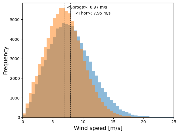
We now define two geo locations of interest, two wind farm sites in Denmark. We will look at the wind speed distribution at these points over the entire 30-year period.
pt_thor_windpark = dict(lat=56.330, lon=8.0)
pt_sprogoe_windpark = dict(lat=55.34, lon=10.96)
counts_thor, binEdges_thor = np.histogram(
    ds_pt_thor.wind_speed, bins=np.arange(0, 30, .5))
counts_sprogoe, binEdges_sprogoe = np.histogram(
    ds_pt_sprogoe.wind_speed, bins=np.arange(0, 30, .5))
Basic statistics can now be computed for the wind speed at these points.
# Calculate statistics of the wind speeds
median_thor = np.nanmedian(ds_pt_thor.wind_speed)
mean_thor = np.nanmean(ds_pt_thor.wind_speed)

median_sprogoe = np.nanmedian(ds_pt_sprogoe.wind_speed)
mean_sprogoe = np.nanmean(ds_pt_sprogoe.wind_speed)
Finally, the wind speed distribution for the two locations over all 30 years can be compared by plotting them on top of each other. Dashed lines indicate the mean wind speed for each location.
fig, ax = plt.subplots(1, 1, sharey=True, tight_layout=True)

ax.bar(
    binEdges_thor[:-1],
    counts_thor,
    width=np.diff(binEdges_thor),
    edgecolor=None,
    align="edge",
    alpha=0.5,
    label="Thor"
)
ax.bar(
    binEdges_sprogoe[:-1],
    counts_sprogoe,
    width=np.diff(binEdges_sprogoe),
    edgecolor=None,
    align="edge",
    alpha=0.5,
    label="Sprogø"
)
ax.legend()

ax.set_xlabel("Wind speed [m/s]", fontsize=14)
ax.set_ylabel("Frequency", fontsize=14)

ax.set_xlim(0, 25)
min_ylim, max_ylim = plt.ylim()

plt.axvline(mean_thor, color='k', linestyle='dashed', linewidth=1)
plt.axvline(mean_sprogoe, color='k', linestyle='dashed', linewidth=1)

plt.text(
    mean_thor * 1.1,
    max_ylim * 0.9,
    '<Thor>: {:.2f} m/s'.format(mean_thor)
)
plt.text(
    mean_sprogoe * 1.05, max_ylim * 0.95,
    '<Sprogø>: {:.2f} m/s'.format(mean_sprogoe)
)
Text(7.3184839723808945, 5557.0725, '<Sprogø>: 6.97 m/s')